Armin Hofmann
His style is immediately identifiable through his strict use of two colours and the strong use of white space on the paper, two colour screen prints can be easily produced but not many designers have created such strong prints as the ones above. The boldness of the white type on the black creates a strong visual effect, this can be seen best on Hofmann's 'Giselle' poster, this combines image and type perfectly while keeping to using just 1 colour, black, and using white space to its full potential.
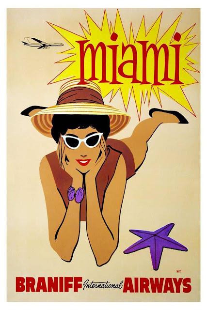
Braniff International
These posters are part of a collection to promote the different places which it ran flights to and from. The 'Brazil' poster is the most famous of the set and is still reproduced for sale by online collectors, all of the posters employ bright visuals through its illustrated imagery and each has its own unique typeface which represents the place it is advertising. The bright colours and bold type are eye catching and vibrant to attract the people to want to go away with Braniff.
Alfred Arndt discovered the Bauhaus in Weimar accidentally, as a member of the popular German youth movement the Wandervogel. After his first conversation with Walter Gropius, it was clear to him that he would stay here. First as a student and later as director of the building and interior design department, Arndt worked at the Bauhaus until 1932. Above is a colour plan for the exterior design of the master semi detached houses in Dessau, 1926. In 1930, he was appointed by Hannes Meyer as the director of the interior design department, which integrated the carpentry, metal and wall painting workshops. From 1930 to 1931, he was the director of the integrated building and interior design departments. From 1931 to 1932, he taught interior design, illustrative geometry and perspective.
Helene Haasbauer-Wallrath
This poster for an exhibition in Basel is dominated by an axonometric rendering of a minuscule kitchen by Swiss architect Rudolf Preiswerk. In the exhibition, visitors could see a full-scale model of the same design, which had a footprint little more than thirty-seven square feet (3.4 square meters). In the accompanying catalogue, German design reformer Erna Meyer identified such compact and ergonomic arrangements as the most important trend in modern kitchen design.
Emil Ruder
Emil ruder was a typographer and graphic designer who helped Armin Hofmann form the Basel school of Design and establish the style of design known as Swiss. He taught that, above all, typography' purpose is to communicate ideas through writing. He placed a heavy importance on sans-serif typefaces and his work is clear and concise, especially his typography. Like most designers who classify under the swiss design movement, he favoured asymmetrical compositions, placing a high importance on the counters of characters and the negative space of compositions. A friend and associate of Hofmann, Frutiger and Muller-Brockmann, Ruder played a key role in the development of Graphic Design in the 1940's and 50's. His style has been emulated by many other designers and his use of grids in design has influenced the development of web design on multiple levels.


No comments:
Post a Comment