MUBI BOOKLET
Universities and students - Using pre-existing methods which are used to distribute event listings and for advertising products, the Mubi listings guide can be easily intergrated into university campuses. For example combining with organisations like the ‘Bag Thing’ which sends out a small brown bag full of business adverts for young people, the Mubi guide can work with these to promote themselves to more people than ever.
The guide can also be placed around cities in cinemas and bars, the easy access to these guides will aid the amount of new users of MUBI, rather than having just an online presence it is best to be placed into cultural places such as bars, cinemas and universities so that the correct target audience can be targeted.
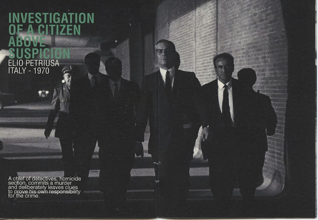
The booklet is printed onto thick news prints which is a cheap production choice to keep costs minimal for MUBI to produce enough to distribute to the target audiences geographical locations. The thick news print has a very off white, almost yellow hue to it, this adds an aged feel to it which fits in the aesthetic of old, timeless looking design. The booklet is influenced by methods used by businesses to promote event listings in a different way. The Booklet uses all the design requirements which are set in the brief, such as type, Helvetica (bold, condensed, condensed thin and regular are used) the colour scheme, only using the two tones of green which are part of MUBI's branding and the information is taken from their website.
The booklet is printed onto thick news prints which is a cheap production choice to keep costs minimal for MUBI to produce enough to distribute to the target audiences geographical locations. The thick news print has a very off white, almost yellow hue to it, this adds an aged feel to it which fits in the aesthetic of old, timeless looking design. The booklet is influenced by methods used by businesses to promote event listings in a different way. The Booklet uses all the design requirements which are set in the brief, such as type, Helvetica (bold, condensed, condensed thin and regular are used) the colour scheme, only using the two tones of green which are part of MUBI's branding and the information is taken from their website.


No comments:
Post a Comment