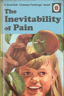
I want to create a retro style of design which employs some of the styles used in children's book design from the 1970's. I looked at these colourful and interesting styles, three of which use illustrated imagery and one a photograph of a made up scene created from toys. The three illustrated covers use minimal amounts of colour yet the ones used are bright and eye catching, they work well together and would interest a child to look at them more closely. All the imagery used is playful and interesting to look at they look funny and childish which would be what a child would want to see. The front cover has to be exciting and interesting it cannot be packed with to much information or a child would immediately ignore it and be disinterested. All of the covers above use simple san serif fonts which are legible and subtle in the sense that they do not take much concentration away from the visuals, which is a good technique to use on a child's book.
I though the style used in this book for identifying animals a fun colourful easy book for children the text goes nicely next to the illustrated images of animals, which are all in the same drawn style, they work well as set together. The pages are easily read and it is clear that the pages conform to a grid system which keeps a good structure and harmony on the page. When considering my own design I should follow a grid to keep the page simple, easy to read yet still create a fun experience for the reader without going over the top.
I wanted to see what style was used on non fiction informational childrens books from this era, I couldnt find many which had a very young age audience but these aimed at 9+ are still something which I can take Inspiration from, the use of Illustrative pictures that resemble photos is playful and appealing to children especially at this time (1970's) where this style was used in a range of things from adverts to music album covers. Again the image is the main focus where as the typeface used is a simple clean readable one which is legible but keeps the focus upon the imagery used.


No comments:
Post a Comment