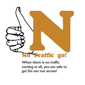
I started to mock up a final page by page design, having shown peers some of the leaflet foldings I had practiced with, I decided due to this feedback that my leaflet should be small ad square, so I played with the idea of having a 100mmx100mm size design. I started off with red, yellow, blue, brown, orange and green as the colours for each letter. I also changed the colour of the type of 'The Green Cross Code' to make it clearer and stand out on the green paper and above the colourful type.
For the 'Stop' I chose to do a stop sign which is recognisable to all even children, I chose to have this letter red which also represents stop or danger, to create a relevance. Again for each page I have used Dover Heavy for the large colourful bits of type and Gil Sans Semi-bold for the rule below it.
For 'Pavement' I was worried that my drawing of a pavement would look just like lines across the page. Having asked my peers I found that the small grate and the angle which I have put the drawing at makes it representable of a pavement and that it is clear and easily perceived.
I was worried when this was put into place that the eyes looked menacing and scary so asked my peers there opinion which all said the opposite, I was given positive feedback saying that the child like drawings will be fun for the young children.
During the peer lead crit I found most scrutiny on this page with the colour not fitting in and not keeping to my audience. Most people found it to be too dark or moody for the leaflet, it was a flat note within the book and suggested a more fun colour such as purple which would then go with my next page.
Again this colour like the last page seemed to dark, my peers liked the orange but would want to see a lighter more inviting one. I was told that with a lighter orange it would work well with my previous page once I change it to a purple hue.
With this green being darker than the stock of green paper I will be using to print upon, it was still very clear and worked well next to the drawings and my peers gave a positive review of how it looked against the paper though being just different shades of the same colour, they saw a great effect emerge.
I added 2 pages of information aimed at the audience parent or guardian, this contains real stats and also a short guide how they can help there children learn the green cross code more than just in the book. I have added the quote Lets not go back to the 70's. Through the peer Critique, it was suggested that I should add an illustration or an info-graph to the page in similar style to my other drawings but with a clear message of what the type is saying. Having looked at info-graphs of pedestrian casualties I can incorporate one into my drawing style and add it to these pages.


No comments:
Post a Comment