Sunday, 22 April 2018

OUGD603 - Left Bank Opera - Design Development - digital

Through perr lead critique it was seen that the strongest idea was the more conceptual colour monoprints. Monoprint was chosen as the medium for this project for its simple means of combining different colours and getting an exciting and textured print. 

The texture and stark contrast of each individual design on the white stock acts as the cultural tensions which the operas play with. 

The individual designs build up to form one over arching image, a clash of all three prints. This combination creates a striking composition which works well to advertise the theme of this years festival, individually the colours seperate to represent each operas specific culture and theme. 

The Monoprints are versatile and can be worked in different angles for different effect. To show this the designs have been applied to a throughout branding to highlight the durabilty of each design as an individual and how it forms together to create the bold visual for the entire festival.

The monoprints have been applied to various materials which could and should be used for the festival;
-Tickets
-Posters
-Website material
- Festival Guides

Through this the wider aspect of the images produced is seen, the experimentation of form and placement gives each artefact seen here and individuality but as a collective and over arching theme and branding is seen.


The design is bold, colourful, relevant and versatile. It can be easily recognised and is a completely new style for there 2018 festival. The designs will give a fresh new burst of life to the Leeds Opera seen, and entice new younger members to want to attend and participate.

Saturday, 21 April 2018

OUGD603 - Anniversaries - Finals


For the production of the publication, informed by research, it was decided that the publication and posters would be printed at a professional printers, this ensured the best possible final outcome for the publication. 

Using Hobs printing solutions I was able to consult with how best the publication would look when printed, the printer suggested two stocks which are popular amongst modern high quality print publications. 

Printing in both Silk Cut High gloss and regular High gloss papers I was able to choose which best raised the publication to a professional level.

The binding method is Perfect bound again this elovates the publication to a higher level and gives it a professional feel, inkeeping with the tone of voice aimed for. 

The posters were printed A1 and act as accompanying pieces to the publication, communicating the significance of the anniversary and shining light on the publication. 

Following printing the publication was placed in situe amongst other high end magazines/publications. Through this we see that it stands out bolder than other magazines it would be placed next too, its simple colour palette and expressive type help it to be bold and fresh in the noise of surrounding and rival works.

OUGD603 - Anniversaries - Page Layout and Design


The layouts for each page are designed around the artwork which is on their, be it the produced geometric collages which are used as break ups for the two languafes and Olgas work.

The first half of the publication which is the contextual side, documents Rozanovas life, using research from multiple texts compiled together in order and showcased in both English and Russian. This is where the hand made geometric images are placed, this adds a visual ellement, forms the layout of the page and makes the content stand out on the white page. The collages also work well on the reference page, cover and foreword page. 

The cover has been designed using one of the Olga inspired collages, through peer feedback it was agreed that this would be the most interesting way, it draws people in with its bold visual design and makes the veiwer want to have a closer look.

Through producing a number of mock up covers it was suggested that these unused covers be made into posters to accompany the publication and draw attention to it.

OUGD603 - Left Bank Opera - Evaluation

The aim of this project was to get the opportunity to work and design the promotional material for a cultural sector event, in this case for the Left Bank Opera Festival - as a designer I am influenced by designers who work on cultural sector design, it is a part of the industry which I have identified as one of my pathway goals. 

Another aim for this project was to explore and creatively respond to the cultural themes of the operas which will be perfomed at this years festival. With it being a cultural event the outcomes could be more creative and conceptual to align with audiences. 

The brief given was vague and the extent of what they wanted was not clear, this meant the brief was taken as far as possible in the time scale given. This meant I went above and beyond designing a wide range of outcomes with the images produced on them.The images chosen on were monoprinted colour compositions which were produced through influences from the cultural art of each opera at the festival. The choices of colour and production were made to get the most relevant and attractive designs.

Producing three different images to represent the different operas I offered a well rounded design stratergy for left banks festival branding. Each image can come together to form one colourful image which can be used to represent the festival as a whole or stand alone to represent the individual opera. 


The project was succesful in achieving the aims set out at the beginning of the project aswell as recieving positive feedback from those who have reviewed it but was not chosen for this years festival. 

OUGD603 - Left Bank Opera - Finals and Submission


The aim was to explore a creative solution to the problem the brief set out. Producing not just one image but three, one for each opera, these work individually to represent the culture and theme of each opera. Together forming a bold colour eye catching image that branding can be applied to in numerous ways.

The images are striking and conceptual, not giving everything away but attracting attention to the information needed to be communicate with viewers. This being said the colours chosen have been informed by the research of the operas in the festival. 

The final solutions were printed on Matte stock initilly but through this the colours of the monoprints lose there sharpness and integrity, alternatively printed on gloss stock the images were as sharp as bold as the originals and even strengthened the colours with a shine. 

The boldness and relation of the imagery make it an expressive and visually exciting solution to the brief.

The Project was submitted on time and awaiting response.

OUGD603 - Left Bank Opera - initial ideas and trials


Looking at the creative processes used in Opera branding and within asian art (especially that related to the plays) I wanted to produce an image which would represent each opera, with each being informed by the cultural background there stories represent. 

For the main image build up I choose to Monoprint coloured compositions, some using shape and form others using just colours to build up natural shapes and textures. 

The colour choices are informed by the cultural backgrounds and themes of each individual Opera

Savitri - Indian - Yellows - Reds - Oranges 
The Original Chinese Conjuror - Blues - Reds - Pinks Purples - Yellows
The Yellow Princess - Greens - Blues -Pink - Yellow

These have been informed by the research into the traditional art forms of each culture.

To give an Idea of how these concepts will look, they have been mocked up with type which will act as a representative of the Operas branding, offering a new style and idea to accompany the festival in 2018

OUGD603 - LIVE BRIEF - Left Bank Opera Festival - Research - Opera Promotion


Thursday, 19 April 2018

OUGD603 - Anniversaries - Typography Research


The typeface chosen had to work in both English and Russian, through research I considered a number of Cyrillic style typefaces but these were impractical when translating to Russian. There are few typefaces that have multi-language letterforms, so this had to be considered. It had to look sleek, modern and legible, but also not a typeface that would detract attention from the work. 

The type choice needed to be easily accesible in both languages and also work in a number of different layouts and forms. Narrowing it to Helvetica and Times as they offerent the most alternating weights and styles in both Russian and English. 

Helvetica was chosen for its simple form and san serif block typeforms. This was the most relevant typeface to keep in with Russian identity (structured bold typeface). Using Helvetica was practical for its varied weights and forms aswell as being the best choice for legibility and simplicity.

OUGD603 - Live Brief - Left Bank Opera Festival - Opera Branding Research


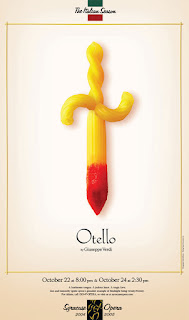
Looking at various Opera company branding and specific opera branding I found that using a consistent yet varying branding - for example Opera North’s seasonal line ups recieve consistent branding depending on the theme that season, though the operas differ theyre brought together under one collective promotion. 

More consistent and related branding can be seen in the Royal Opera house branding, firstly th branding for the ballet opera festival in which they use different colours to represent the different performances of the festival. 

Looking at more creative examples of Opera branding - Annie Merick is an illustrator and creative from Leeds, she designed a campaign for Royal Opera house to entice young people to visit the opera, her use of bold colours and shape to represent the opera is bold and eye catching.