Wednesday, 17 May 2017

OUGD505 Evaluation


The main aims of OUGD505 were to produce projects which show a clear understanding to a topic, this meant both studio briefs would need a wide body of research and exploration as well as informed relevant design to show that the subject has been approached correctly. For studio brief one, I visited Leeds City Museum to learn more about the cities history and to find a subject for the poster to be on. This led to looking at Quarry Hill Flats and the history of the modernist flats which sat in the city centre until the late 70's. The research undertaken was throughout and well explored, this can be seen through the production and outcome of the posters. With studio brief two, a different style of research was needed, instead of looking at historic happenings, the topic was ethics, and ethical design or good design, this meant exploring a topics which affect people, looking at things for for good, charities and organisations, this lead to looking at anti-war movements and groups who are opposed to war. This then evolved into looking at protest art and movements which protested and produced protest pieces and anti-war art. Recent political news of a snap election occurring on June 8th meant that the project could have a clear campaign point, this led to the design of the final outcomes produced. A clear design path can be seen within either project, though studio brief two has a much stronger evolution to it, with a wide body of research being undertaken and high quality outcomes produced.

Throughout the module I have been able to explore traditional print in different ways, firstly through studio brief one, which required the production of a traditionally printed A3 poster, the limitation of having to produce a printed piece meant that I could explore other processes such as mono-print which is a key feature on the poster. Print was also explored through studio brief to where my research led me to produce a screen printed outcome due to production considerations. Both projects explored print in different ways and both relevantly and effectively, with the tones wanted for either brief being achieved. This was also an opportunity to experiment with poster form and size, with the posters in SB2 opting for a long format, this helped fit more content on the page while keeping all elements bold and clear. 

Overall the SB1 project helped me to explore an interesting topic and influenced a refreshed look at swiss design as well as being an opportunity to explore more print methods, attempting to strengthen monoprint techniques and seeing if it is an easier medium than screen print in some aspects. The outcomes I feel could have been cleaner, mono-printing has its down falls in that the paint easily gets through thin paper, this is a consideration which will be remembered and considered in future projects. Though the outcomes are still interesting and relevant representations of the research and project undertaken. SB2 made me consider the actions of a designer and the messages which can and should be put into public view, looking at a heavy topic of war I had to be careful what could and couldnt be said, the brief helped me consider my own actions as a designer. The project explores anti-war themes, looking at protest design and peaceful organisations, this influenced a propaganda style piece which was screen printed, these outcomes were strong and were met with positive feedback from peers. The module has helped me to explore wide research, new design processes and made me think of design considerations such as production, content and distribution, all of which has been well explored and outlined within SB2. 

Friday, 12 May 2017

Ethical Design - Screen Printed posters - Bulky News Print

Screenprints Stock One - Bulky News Print

Looking for a stock which would be both, cost efficient and heavy enough to print on, the stock had to be easy to place around walls and poster boards. Choosing to use bulky newsprint was made through looking at other posters and how they are printed, bulky newsprint is 6p for an A1 sheet this can produce 3 posters at the size of 520mm length x  298 widths, this is A3 size with 100mm on the length, this is not an unusual technique in poster design, inspired by my recent interview with Nick Loaring of the Print project whose posters are long and thin, much similar to this size, it is a technique to fit more information onto the page. 

The bulky newsprint is an off white almost cream in colour this helped the red stand out well, making it bolder as well as giving character to the white space of the page. The paper has a rough recycled grain to it, this is one of the aspects which makes it cost effective and also environmentally friendly. The prints came out really strong and clear, the production ran very smooth which enabled a large production of posters, this outlines how simple and cheaply multiple posters can be produced to a high quality.    


Ethical Design - Screenprint - Yellow stock - analysis and feedback


With the production method being screenprint, there was a freedom to try different stocks of paper. Influenced by the research into protest design such as 'See Red' and the work shown in Astrid Prolls book 'Goodbye To London - Radical and Political Art In the 70's' which showed political art work printed using bold colours on bold coloured paper to make it eye catching and striking, with this in mind, yellow stock was purchased. Though with it being more expensive than the bulky newsprint it meant the production would be more expensive and fewer posters produced, which meant these limited few would be best placed in busy places where it would be seen by the most people, a limited print run in strong social place such as a student union or popular bar. 

The print onto the yellow stock made the red bolder and firmer than it had printed on the News print, the image was stronger aswell as the black type which stood out stronger too, this worked well with the central and bottom type. The head type, which is covered by the red Komika Axis font, has come out so strong that the red cannot be seen well until up close. Apart from this the posters are bold and visually striking. 

Through feedback of these posters I was told of connotations of Kodak with the three colours which feature on the poster. Though the over all response was positive and people suggested that the posters, both on yellow stock and bulky news print, should be posted together, the repetition of the bold images makes it more striking than if alone.  

Thursday, 11 May 2017

Ethical Design - Screenprints - Off white card


Continuing to experiment with a range of stocks to get the best prints as well as the most cost efficient stock, this off white paper offers a thicker quality that both the yellow stock and the bulky newsprint though the prints that were produced were faded in different ways, of the number printed on this stock only 2 came out up to a good quality. The lower sections of the  poster, the subtext of the poster is very faded and almost unreadable this did not occur on the two other stock types. 
Despite set backs these prints got high praise through peer feedback and a good choice of stock.


Ethical Design Negatives and final digital design

Designing for Screen printing

Having explored a number of design ideas for how the content could be displayed, choosing the below design as it felt most effective, bold and informative. The type in black has serious bold tones which make it eye catching and loud, while the red type adds a playful more engaging feel to it, it also stands out above the black, an effect when screen printing these colours, though will have more of a blended look, and the effect that the red type has been scribbled onto the real printed type, giving it a propaganda style poster, though undertones of a real hard hitting campaign. The posters intention is to make people not vote for the Conservatives in June, but it is not literally telling people to do that, but saying vote no on war and using images and slogans which suggest vote no for tories. Elements such as the image of Theresa Mays face have been cropped down to focus on her mouth, not her full face, this is to excentuate the words she is speaking which feature on the page, these are covered with the synonyms of the words, the opposites, 'broken' and 'untrustworthy', this is to outline Stop The Wars stance on Theresa May, something which they project through the website which the poster directs to.

The typefaces used are Akzidenz Grotesk Medium (main black type 'Strong and stable', 'Stop The War') Akzidenz Grotesk Regular (Subtext 'Theresa may will seek a vote in parliament for British airstrikes against Assad if she wins a big enough majority in the general election. she is keen to step up british military involvement in the middle east. find out more at stopthewar.org') and Komika Axis (Red text handwritten style 'Broken and untrustworthy', 'Vote to') this was chosen because of its handwritten nature, making it look as if it has been painted or drawn over in thick red medium, giving it a feel of protest, though the smaller Komika Axis type that sits at the bottom of the page gives a sense that its part of the branding of the poster rather than graffiti.

The below images show the individual negatives and which colours they will be, these shall be turned black and printed out to use as a negative in exposing a screen, the image has been halftoned to make it printable.


Ethical Design - Stop The War - Campaigns

STOP THE WAR

Founded September 2001 in the weeks following 9/11 when George W. Bush announced the war on terror. Stop the war has since been dedicated to preventing and ending the wars in Afghanistan, Syria, Iraq, Libya and elsewhere. Stop the war opposes the British Establishments disastrous addiction to war and its squandering of public resources on militarism.

Stop the war has organised around 40 national demonstrations, including the largest protests ever held in Britain, most memorably on 15th of February 2003, when up to two million gathered on Londons streets to oppose the war in Iraq. All money raised from merchandise is used in Stop The War's campaigning work, opposing the Governments war policies.


Stop The Wars merchandise ranges from t-shirts to badges all which keep to a singular style, using large bold san-serif font, yet replacing o's with a blood spot, this also appears on their famous 'Bliar' t-shirt and poster. The site also sells posters by Peter Kennard, Martin Rowson, Jamie Reid, Ralph Steadman and Clifford Harper. Having looked at a number of these I feel that the style of the design work produced should have influences from these different aspects, though it must remain relevant to the brief.

Concept - Working on a new protest/series of propaganda for Stop The Wars - using graphics, slogans and facts as content for posters, banners and flyers.

- Current evidence to consider using - The press is full of reports that Theresa May will seek a vote in parliament for British airstrikes against Assad if she wins a big enough majority in the general election. They show that she is keen to step up British military involvement in the Middle East and in particular that she wants to position Britain as Donald Trump's most enthusiastic and loyal military ally.


Ethical Design - Meme Culture and Current Politics


In todays society social media and digital content is at the forefront of everything, being use by political groups to broadcast messages and ideas through status', videos and images. A more modern aspect of social media phenomenon is Meme's, these a comedic images defined as 'an element of a culture or system of behaviour passed from one individual to another by imitation or other non-genetic means.', memes are used as social commentary, with topics like politics being commented on, above are a number of memes which have been produced and shared (viral) on social media which are inspired by the upcoming general election. Memes are being used to scrutinise political leaders and ideas, for example Theresa May has been under scrutiny for her policies and the phrases she has used in recent interviews and speeches, one which has been heavily looked at on social media and meme culture is her 'Strong and Stable Leadership' quote which is being used in satirical ways to undermine the current PM. These techniques echo those which were used in the past just through different ways, editing photos of popular culture icons (i.e Daleks) and adding Theresa Mays face to mock her, making her look like Davros an evil overlord character from British tv show Doctor Who.

These techniques and quotes can be used on a bigger scale to produce posters and put across messages in an almost satirical style.

Ethical Design - Digital experiments - idea development


Through Drawn experiments, it helped me to realise the style and tone I wanted the poster to communicate, though to fully feel the effect of the words and the tone of the poster, it had to be produced digitally to push where it could go. Through designing ideas digitally the project soon evolved into new ideas and different ideas which adopted more colour, larger type and a cleaner feel than the rough images had previously been outlined in the development stages. I experimented with the colours that could be used, looking at black as the main colour, yet attempting to add in reds and greens, primary colours which would make type bold, especially with the black type. I refrained from using images to begin with, only experimenting at the end with them, wanting to keep a type heavy poster as that is what is needed on this poster, it will hold the chosen content which clearly puts across the message of 'Stop The Wars' 'Vote No to War' campaign. Choosing to use bold san-serif type to have bold clear type which clearly shouts the message off the page, I began by using Universe bold a simple standard san-serif font with simple features though this was too simple and didn't have much personality to it, at least not one which was needed to be on the posters. Looking at repetition of the message to really get it across and how the words can be used most effectively, experimenting with rows, large type, overlapping and different colours, though at this point the limitations of digitally developing the posters became apparent. 

Through playing with form and colour it became clear that the posters were too flat and needed more character to make them unique, stand out and project the message within the content. These limitations and inspiration from research influenced the idea that the poster would be screen printed. Many political posters are screen printed and produced through more traditional methods, this method is cost efficient while also being a simple way to mass produce posters. Though screenprinting is not without its limitations, there are different things which must be considered such as colour mixing, stock and printing preparation. The posters are A3 but can be transferred onto A2, the screens for screen printing which are available will accommodate up to A2, though that is a huge size which would make them difficult to distribute, especially if the posters will use a Guerilla style of ad campaign where the posters will be put up across the city without permission. The design needs to incorporate the bold message as well as be viable to screen print.


Wednesday, 10 May 2017

Ethical Design - Design for back of flyer - Development


The design for the flyers is based on the design of the posters, this was to keep a continuing theme throughout the posters, it was essential to create a form of style to be associated with Stop The War, this way the whole campaign can take a set form, opening it up to badges and online content. The leaflet could be a smaller version of the poster, taking slight design differences due to the different manner of print. The flyers will be digitally printed so that many can be produced, more so than the screen printed posters which will be up in a number of places, the flyers can be placed and handed out on a much wider scale. 

The image is the slightly different from the one on the poster, again using the same original image but a different perspective using just the eyes in a black and white tone, there is no need for the image to be halftoned if not screen printing, it would not have the same effect as the posters. The type has been changed slightly to fit the size of the flyer which is 105mmx108mm (though this can be changed when coming to print. The type is changed to the 'Vote no to war' style of black around white type, to make it bold while the red Komika Axis lays over it. The flyer features an added element which was not used in the posters, saying 'Register by May 22nd and' this is to get more people voting and using something we are privileged to have as a democratic country.


Ethical Design - Research - UN Human Rights

The Human Rights Act - In the UK


  • The right to life – protects your life, by law. The state is required to investigate suspicious deaths and deaths in custody; 
  • The prohibition of torture and inhuman treatment – you should never be tortured or treated in an inhuman or degrading way, no matter what the situation;
  •  Protection against slavery and forced labour – you should not be treated like a slave or subjected to forced labour; 
  • The right to liberty and freedom – you have the right to be free and the state can only imprison you with very good reason – for example, if you are convicted of a crime; 
  • The right to a fair trial and no punishment without law - you are innocent until proven guilty. If accused of a crime, you have the right to hear the evidence against you, in a court of law;
  •  Respect for privacy and family life and the right to marry – protects against unnecessary surveillance or intrusion into your life. You have the right to marry and raise a family;
  •  Freedom of thought, religion and belief – you can believe what you like and practise your religion or beliefs; Free speech and peaceful protest – you have a right to speak freely and join with others peacefully, to express your views;
  •  No discrimination – everyone’s rights are equal. You should not be treated unfairly – because, for example, of your gender, race, sexuality, religion or age; 
  • Protection of property, the right to an education and the right to free elections – protects against state interference with your possessions; means that no child can be denied an education and that election must be free and fair.

Ethical Research - Political stand points - Labour views on war/conflict

Labour Manifesto - Taken from Jeremy Corbyn's 'Spoken manifesto' from recent speech in Manchester where he outlined Labours pledges if elected in the upcoming snap General Election on the 8th of June.

- The manifesto says Mr Corbyn is committed to achieving a "nuclear-free world" and is "extremely cautious" about using Britain's nuclear deterrent.

- The Labour leader will only send the armed forces into combat if "all other options have been exhausted", the copy of the manifesto states

But the party is facing a series of rows about its pledges on defence amid concerns from some in the arms industry that a vow in the manifesto to scrap weapons exports to Saudi Arabia will cost jobs. The leader, who has been staunchly anti-nuclear weapons for his entire political career has previously clashed with his shadow defence secretary Nia Griffiths over whether to include a commitment to renewing the Trident missile system in the party's election document. The document promises to move towards "a nuclear-free world" and while supporting the renewal of the missile system the draft document adds: "But any prime minister should be extremely cautious about ordering the use of weapons of mass destruction which would result in the indiscriminate killing of millions of innocent civilians.”


Ethical Design - Research - The Design of Dissent - Milton Glaser


 The Design of Dissent - Milton Glaser 


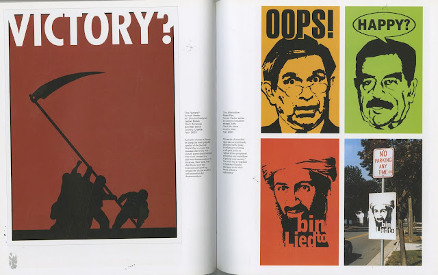
Milton Glaser's book looks across at design work from around the world which is for the purpose of dissent. Glaser's book heavily features anti-George bush propaganda as most of the work is taken from that late 90's early noughties era. The book looks at political and social issues and the best design which have come out of these times. A range of methods and techniques are explored through the posters, many are digitally produced images for guerilla campaigns and protests, though some explore other methods such as stencil and spray paint, photomontage and even through visual essays. The works below are the pieces which were relevant to the Anti-war project I intend to do.


  •  'Got Oil?' - Nenad Cizl / Tom Tomasck - For Magdenela young creatives festival - Slovenia 2004 - "The power of this poster depends on peoples knowledge of the 'got milk?' campaign
  • 'Blind' - Sonia Freeman / Gabriel Freeman - Spain 2003


  •  'Alternative Street Signs' - Michael Duffy - USA - 2003
  • 'Victory?' - Jadran Boban - Croatia - 2003


  • 'Mom we're home!' - John Yates - USA - 1987


  • 'We Don't Need Another Hiro' - Yossi Lemer - Israel - 2003
  • 'Third War' - Tahatman Aminian - Iran - 2003


  • 'Pushing the right buttons' - Erica Rothenberg - USA 1982
  • 'Human Resources' - Tahatman Arminian - Iran 2002


  • 'As seen on TV' - Jeff Louviere - USA 2000
  • 'Hope' - Charlie Ross - USA - 1999 (use of newspapers, current, topical)


  • 'American Bible Belt' - John Yates - USA - 1995


  • 'All the news that fits' - Paula Scher - USA - 2001/2003
Scher's visual essay observes "The news abruptly switched from a background of sex to a background of terror without missing a beat."


  • 'Childhood is not childs play' - David Tartakover - Israel - 1998
  • 'Pain' - David Tartakover - Israel - 1989
  • 'Man, Nature, Society' - David Tartakover / Alex Levac - Israel - 1992

Ethical Design - Research - Paper Politics

Paper Politics - socially engaged printmaking today

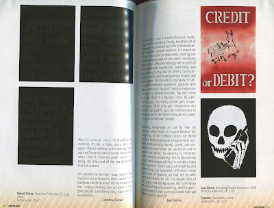
The project originated in the George W. Bush era in 2004 when fears were high for the political left following the September 11th attacks and the failure to stop a US invasion of Iraq. The posters below are the voices in anger against these times. The prints below are the ones which were most powerful and most eye-catching on the page, as well as being ones which were most appropriate to the project. The featured artists which I have been looking at within the book are;


  • Goatskull - smoke em out! - 2003 - screen print 
  • Csilla Kosa - Say Not - 2000 - screen print
  • Nathan Meltz - This machine kills fascists - 2007 - screen print


  • Gabriel Cohen - send one to get one (1,2,3) - 2007 - screen print
  • Sam Sebren - Breeding Zombie Consumer - 2008 - stencil and paper cut
  • Spazmor - Skull phone - 2004 - screen print


  • Arthur Desmarteux - Our Father In Heaven - 2006 - screen print
  • Claude Moller - If Vietnam Were Now - 2004 - screen print
"If my prints are good, they should help union or neighbourhood struggles in a strategic way, by publicising a campaign, exposing corrupt politicians, winning new members, getting more media, or winning local reforms. If my prints are really good, they should clearly break down a complex issue and make you go through an ideological shift." - Claude Moller


  • Don Feckner and Don Leicht - Invade - 2006 - stencil
  • Rebecca Johnson - Mcdubya - 2004 - Screen print


  • Lydia Crumbley - untitled - 2004 - lithograph
  • Joshua Pablo Rosenstock - It was a very good year - 2003 - stencil
  • Alfonso Jaramillo and Marcelo Reyes - Spare Change For Bombs - 2006 - screenprint


  • Maro Lepson - One Way 2003 - screen print
  • Chris Cardinal / Closed circuit - War Hero - 2005 Screen print


  • Periphel Media Projects - Abolish Alienation / Sgt. Guy Debord - 2003 - screen print
  • Gabba Levtchenko - Bad Neighborhood - 2003 - screen print
  • MK - Bonzai - 2003 - screen print