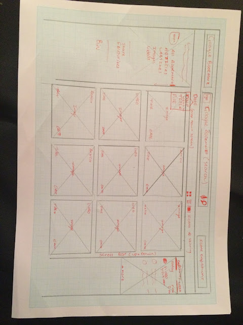
It was clear to begin the development of the interface away from a computer, drawing up and sketching ideas helps make the vision clearer and these designs can also be used to tell the developer how the page will be set up, including the drop down box features and the small unique points of the site. Above is the header of the interface, keeping with Googles usual layout for this, as it only changes slightly on every page, though incorporating the Bookmark brand to by featuring the title in the top left of the page. The Header features 4 drop down boxes one for choosing how to view the contents order (Date, Title, File Size) one for choosing how to view the contents on the page (Thumbnail, List, Cover flow) One for the apps drop down box Google has on every page and the last for the settings of the page, this is also featured on all Google Interfaces.

The main interface when on Google bookmarks will look like the above image with a cover flow effect on when the site is opened, this cover flow will show images of the website, article, etc. The images will be accompanied by the information about them listed beneath, the cover flow will go left to right showing the images of the saved content (Developers will allow an arrow button to work the images left to right). The listed information below the images will show the icon of the website or article or a small icon to represent what the file is or where it came from, it will also show the date or time it was added to Bookmarks. The right hand tool box will have the options of different content to view with the options of ;
- My Bookmarks
- Websites
- Articles
- Images
- Videos
- Favourites
- Share
This will be the different things the user is able to save onto bookmark, using a similar technique to how Google Drive works when one of these options is clicked on it will turn blue and the small blue bookmark icon will move next to the chosen title, for example above the 'My Bookmarks' option is chosen and is clearly highlighted by the blue bookmark icon and a blue dash. The left hand bar will show the users recent activity with the options of day, week and month so that there is a good log of the users content and what they are looking for is easily located, the content shown on this will feature the title of the site, article, image or video with an icon representing which one to the left of it with the date and time it was added, to the left. The header including the search bar will keep to Googles original style with the title of the app next to the google title and a small Bookmark icon will feature on the left hand side of the search bar.
This will be another view of Google bookmarks showing the different viewing styles of the page and content, this one will be a simple thumbnail layout style with some effective updates to make the experience easier and simpler. The page will become more concise with the left hand activity box moving up next to the header and the content will be centralised to the middle, the content being thumbnails of images will small text underneath to caption what the file is. A new feature added to enhance the user experience will be when the thumbnail is hoovered over it expands and shows the user part of the website to look over so that accessing the full website is not necessary, the information is held on the page (Developers to show this with an expanding screen inspired by the Launchpad on a Mac Book) Screen will scroll down with a cursor hovering over an icon.
The back grounds or base colours will use white and grey like the current Google Set up, the type will change from dark grey to black depending on location;
- Left Hand tool box - Grey - Dark Grey type - Blue Bookmark icon
- Right hand tool box - White - Black type - Blue highlight for different options
- Central areas - Grey - Dark Grey Type - Icons for each bit of content
- Header - white - grey search bar - google title and icons


No comments:
Post a Comment