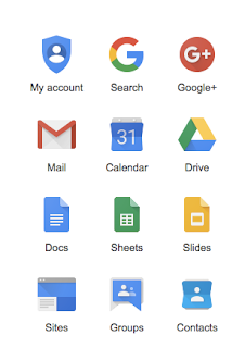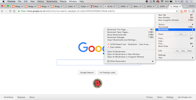
Problem - Google Chrome - Bookmarks. Current bookmark collection is hidden away and unused non of the book marks go to this 'Tool' Google offers, yet on the browser the only way to do it is on a scroll down tab on a tools icon in the top corner of Google Chromes browser. As a student and creative I use the bookmarks tool to keep track of particular websites and also specific pages on websites to later return to, I feel Google Chromes service of bookmarks, is difficult and is not user friendly, it is an important part of my user experience and I feel Google Chrome should Identify this tool as one of its main tools as an extension such as the tool kit it uses now (Image)

Problems:
- Hidden away
- Unused as its so hidden and is not synched to the google chrome browser bookmark system in place.
- Clunky
- Difficult to navigate
- unclear
- Bland
- Difficult to read (Bookmarks are kept to be able to return to the website later on yet with Google Chrome it is difficult to see what the bookmark was specifically and why it is important)
- no page on which to view all my book marks in a clear view
- Only other option is to use 'Open all Bookmarks' tool which would open all of them on the browser.
No comments:
Post a Comment