Thursday, 22 December 2016

Screen Recordings for Google Bookmark - Visual Representation for the App


To develop the Interface further it was key to show how the application/tool would work whilst the user is browsing, for this it was clear to use a screen recording which could then be edited to look like a real app, this would help to understand the way the concept behind the app works, aswell as seeing more of the apps features. For the visual showing of the work a Adobe After Effects video has to be produced, with the interface being developed is a Google Product it became clear to have it as a small advert style showing the new application, the way it works and the key features which it has.

Looking at existing bookmarks to work from it was clear to use a creative website to show the app features off, with Creative reviews website being one of the bookmarks it seemed appropriate to use this for the screen record, as well Creative review is full of articles which can also be saved onto Google Bookmarks, this would help to show more of the features of the tool.

Having researched into Google adverts, the branding can be seen throughout from the colours to the type used it is unmistakably a Google product, there branding is embedded into the minds of computer and phone owners alike and is now easily recognisable from the simplest of things. The advert needs to show the features of the application as well as the Google branding, using the colours they use and the type to, as well as featuring the chrome and title logo.

For the idea of using music to overlay over the video of the web app, whilst researching and looking on creative review to take the screen record, one of there featured articles was a piece on David Bowie, this was one of the first things viewers see on the Creative review website, a bowie song to overlay and help the screen visuals flow on the video can make the video more exciting and engaging for the viewer to make them download Google Bookmarks. The first Bowie song to come up on a Google Search was 'Lets Dance' an up beat song which will make the advert feel more professional while keeping it fun and keep people interested.

Tuesday, 20 December 2016

Interface Components and solutions


After hand sketching the wireframes for the website, development of it online would be different, designing the interface through Adobe Indesign helped to keep a consistent grid system to it, having researched into web design it became apparent that a 12 column grid was the best for online design, if followed correctly it would help to develop a clean easily navigated interface. Keeping Googles current header style, two different styles for the Bookmark Interface were designed, only with slight differences to one and other as the top one features a grey section under the search bar while the other does not. When shown to other designers it became apparent that the second header which was all white was the popular choice with peers saying: 

"The second header is cleaner and the all white will make the interface feel more spacious and modern, it also makes the icons clearer for use"
'The all white header works better as the features are more visible and this design shows the use of a grid and layout better than the first one"


With my feedback on the Header for the interface I developed the main background for the site, a grey shape which could be utilised to have a cover flow style of movement (Developers would use this template and layer the images behind it with the type on the front of it in a darker grey or black. The images above will be the ones that are featured on the cover flow which will go left to right showing these snippets of saved websites, for the thumbnail page similar images will be used but will be square. These images have been chosen as they feature on a self made bookmark page (Bookmark pages taken from male art students current bookmarks page).


The images under the cover reel will be in list form to keep the information about the content clear, it will have the title of the website or individual content and also the link the original site (Apart from on images and videos as the links are to long, developers will put in drop box so that this information is available if necessary). The information will include a small icon to show the file, for example with youtube or creative review they have there own logos as an icon where as if it is an image it has the small camera icon which was produced for the site (Above).  Looking at the way the cover reel would work, on the top image a small bar which conceals the caption of the image being shown as well as right and left arrows for movement, simplifying this further in the second image, with making it just a list and having larger images, with a touch pad or mouse scroll effect which moves the reel of images along.


The right hand tool box will show the user there activity with the option to view there saves from the day, the week or the month, this will keep a log of there most recent saves and will show the date and time next to the information. Again the icons will feature next to the title and link this makes it clearer and a small image can be used to recognise the link without actually reading the name or link title. The options will be highlighted in blue when selected with a blue underlining bar also highlighting the chosen option too, this will slide to the other options clicked.


The thumbnail view page will layout like this, with the dates added underneath the imagery, these will offer a scroll over option where when the cursor hovers over the icon it will expand and the user will be able to view content from the page which is saved. This expanding screen feature will be visualised using  screen record to show scrolling down through content of a web page whilst still on the bookmark site.


Putting together the components to produce the two above views of the Google Bookmark main page. The top image shows the Cover flow view of the interface where the images can be scrolled through left and right, through development on after effects this will have the images behind the grey screen so that the images move in and out of site while the rest of the page will remain the same. A simple cursor will be added so that it looks to navigate through the page, this will lead to the next screen with the thumbnail view, on this page the images are laid out in rows and columns and is very image heavy. The cursor will scroll down this page looking upon the many different saved bookmarks and then will scroll over one of the thumbnails which will expand to reveal the webpage within the google bookmarks interface, the surrounding features on the screen will lower in opacity to make the expanded section more visible and the main point of view.

To show how the app works, when browsing through the web, a small version of the Google Bookmark icon will sit on the toolbar, when a website is accessed and the user wants to bookmark it, they will click the button and the bookmark icon will drop down to show that this is one of the pages bookmarked, the icon will be clear yet will not affect the look of the page the user is viewing. For images and videos a user wants to save they just have to drag the image or video upto the bookmark icon in the toolbar where a drop down add box will appear to show that the content has been Bookmarked.

For this solution to be recognised it will be effective to use screen recordings and add in the Bookmark content afterwards to show the idea as a visual, the websites which will be added will then be featured on the Google Bookmark page itself for example above with creative review and Youtube.


Sunday, 18 December 2016

Wireframe / Layout of Interface


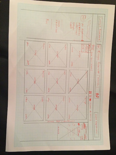
It was clear to begin the development of the interface away from a computer, drawing up and sketching ideas helps make the vision clearer and these designs can also be used to tell the developer how the page will be set up, including the drop down box features and the small unique points of the site. Above is the header of the interface, keeping with Googles usual layout for this, as it only changes slightly on every page, though incorporating the Bookmark brand to by featuring the title in the top left of the page. The Header features 4 drop down boxes one for choosing how to view the contents order (Date, Title, File Size) one for choosing how to view the contents on the page (Thumbnail, List, Cover flow) One for the apps drop down box Google has on every page and the last for the settings of the page, this is also featured on all Google Interfaces.


The main interface when on Google bookmarks will look like the above image with a cover flow effect on when the site is opened, this cover flow will show images of the website, article, etc. The images will be accompanied by the information about them listed beneath, the cover flow will go left to right showing the images of the saved content (Developers will allow an arrow button to work the images left to right). The listed information below the images will show the icon of the website or article or a small icon to represent what the file is or where it came from, it will also show the date or time it was added to Bookmarks. The right hand tool box will have the options of different content to view with the options of ;
  • My Bookmarks
  • Websites
  • Articles 
  • Images
  • Videos
  • Favourites
  • Share
This will be the different things the user is able to save onto bookmark, using a similar technique to how Google Drive works when one of these options is clicked on it will turn blue and the small blue bookmark icon will move next to the chosen title, for example above the 'My Bookmarks' option is chosen and is clearly highlighted by the blue bookmark icon and a blue dash. The left hand bar will show the users recent activity with the options of day, week and month so that there is a good log of the users content and what they are looking for is easily located, the content shown on this will feature the title of the site, article, image or video with an icon representing which one to the left of it with the date and time it was added, to the left. The header including the search bar will keep to Googles original style with the title of the app next to the google title and a small Bookmark icon will feature on the left hand side of the search bar.


This will be another view of Google bookmarks showing the different viewing styles of the page and content, this one will be a simple thumbnail layout style with some effective updates to make the experience easier and simpler. The page will become more concise with the left hand activity box moving up next to the header and the content will be centralised to the middle, the content being thumbnails of images will small text underneath to caption what the file is. A new feature added to enhance the user experience will be when the thumbnail is hoovered over it expands and shows the user part of the website to look over so that accessing the full website is not necessary, the information is held on the page (Developers to show this with an expanding screen inspired by the Launchpad on a Mac Book) Screen will scroll down with a cursor hovering over an icon. 

The back grounds or base colours will use white and grey like the current Google Set up, the type will change from dark grey to black depending on location;
  • Left Hand tool box - Grey - Dark Grey type - Blue Bookmark icon 
  • Right hand tool box - White - Black type - Blue highlight for different options
  • Central areas - Grey - Dark Grey Type - Icons for each bit of content
  • Header - white - grey search bar - google title and icons


Interface research


One of the features of Google Bookmarks will be a swipe over effect where when the mouse scrolls over an icon or image, it will enlarge and show the content of the link on the page on Bookmark itself, like in Launchpad on a Apple Mac, the interface is rows and columns of icons with there title beneath them, yet there are folders within this which when scrolled over stretch out and show more content to the user. When the file expands out, the images in the background blur to make the expanded file the main focus on screen, this is a useful tool and an easy to hold more content than appears available on the screen.

Icon Design


Through looking at googles current Icons, logos and symbols it became apparent that Google produce these that can be easily recognised to be there own brand, the colours being four distinct versions simple colours and the icons used for there apps are all identified to be extensions of Google. For Google Bookmarks the design needed to be three things;
  •  Simple
  •  Recognisably Google
  •  A symbol to represent the application 
  •  

 The icon will sit amongst the other applications on Google Chromes drop down box, at a medium size, to go along with the other application icons. The icon will also sit on Chrome toolbar at the top of an interface next to the main search bar, this will be to add websites at the click of a button as well as to be used as a drag and add system to where a large version of the icon will flash on the screen to show that the information has been saved. On the interface of Google bookmark the icon will feature in the google search bar at the right hand side while a small blue one will be used as a marker for which page the viewer is viewing.

Keeping to using Googles chosen 4 colours of Red ( D84437 ), Blue ( 4285F4 ), Green ( 0F9D58 ), Yellow ( F4B400 ), to make it easily branded to Google, the correct combination of the four colours was needed to make it a successful, as well as the shape, having looked into traditional versions of Bookmarks, particular the forms and visuals on them, it became clear that there is a shape which represents bookmarks, the rectangle shape with a triangular gap at the bottom of it (Derived from the ribbon or string used to hold ones place within a book) more modern physical bookmarks keep to just a rectangular shape but there is no identity in a multicoloured rectangle, so to make the icon clearer and recognisable it was more effective to use the traditional classic shape.
The colour pattern for the icon is inspired by a series of Penguin Random house issued physical bookmarks to promote LGBTQ Pride, where they used a rainbow style one which each colour placed next to one and other in a diagonal style.

Saturday, 17 December 2016

Interface Feature research - Google


Google Drive has a thumbnail option of viewing the content the users saves on to it, with a small thumbnail image and the name of the file beneath with a small icon to show what sort of file it is for example Google use a small mountain symbol on a red background to represent images. Also when hovering the cursor over a file, a small drop down box will tell you what folder or project the image is from, for example above the image reveals it is part of the folder titled 'Advertising Brief', these simple features improve the users experience by making the content easily identified and clear.


Google Drives left side bar is where different categories of files are shown, when changing from one to another the colours go from dark grey to blue to show which option the user is on. This effect is simple but effective to give a clearer user experience. The icons are not overly necessary but add a clear touch so the user can familiarise to the simple small icon rather than to read text.


Google applications set out the data saved on them by having the most recent content at the top of the page (i.e. Gmail, Google Drive, etc) this is through keeping a log of the date and time the content is put onto the app, the date or time is normally clear on the page, especially when the content is listed.


Google uses a lot of drop down menus on words and icons, for example the image above is from Gmail where there is an option to view three different things, this saves listing these other options on the same page, it leaves the page looking clearer and less jumbled. 


Google drive offers two views of the main page one which lists saved content and the other shows thumbnails of the saved content, the main one when Google Drive is opened is the thumbnail style, it shows the content more clearly by using images of the file as well as giving the type of folder it is through a small icon and the title of the file, each file has a tile on the page, this is clear and effective. Though the two views are effective, another view which focuses directly on the images would work well with being able to see the image at a larger style with the information small beneath it, like the cover flow style on Finder. It would be effective to explore the different styles of showing information and content on a web page.


Google Bookmark - Wireframe


The interface wireframe, this shows the basic start point for Google Bookmarks, loosely following the ones Google use now, for example this takes aspects of Googles normal search engine and header style while also taking aspects from Google Drive. Above shows what each section will contain on the screen including some ideas of how the page will work and look. The Image reel style in the centre of the page is inspired by the image reel viewing options on a Mac's Finder interface. This will be the structure of one of the bookmark pages, there will also be a thumbnail viewing version. 


Thursday, 15 December 2016

Interfaces - What works?

Secret 7", the annual record sleeve design competition, have a very clean and accessible user interface, the information and imagery is clear and easily navigated. The images are clear and visible to be easily scrolled through and viewed, the type is also clear giving the name of the designer and the title of the song it represents. This is a very effect thumbnail style it gives the option to scroll over and enlarge the image for better viewing.

'Google Bookmark' can use a similar style with a scroll over and enlargement effect, this can also be used to show the website or article which would be saved onto the bookmarks page with a snippet of the page which the user can explore.


Google Drive has an easily navigated interface though is very type heavy. It offers a range of different viewing options and categories to the user, while also being compact and full of information. With this being a Google application it is the style which will be used on Google Bookmark, sharing similarities but having different functions with Bookmark having some new features. Google bookmark will use a similar formula and wire frame as Google drive so that it keeps it to the google standard but will eliminate some of the unnecessary features which are on some of the google pages. For example Drive uses an add button, Bookmark will not require this as the content is added whilst on other pages.

Tuesday, 13 December 2016

Google Branding Research.


The google branding is clear through its title/logo which employs four colours red, green, blue and yellow, all of which are not the basic tones of the colours, each is a distinct shade original to google to make people recognise google through a set of colours. The Pantones for these colours:
  • Red - DB4437
  • Blue - 4285F4
  • Green - 0F9D58
  • Yellow - F4B400
At least one of the colours features on all the icons Google use for apps or even there own Chrome logo which employs all for colours equally. The colours are slightly softer than there regular shades, this gives them a more natural look and friendlier feel.


The icons google have produced for there apps vary in style, some use all of Googles four colours yet some use one or two, there is a mixture of shape styles to with some having rounded edges (Gmail) and others having sharp angled edges. The ones which feature all for colours are more friendly, bright and accessible, it makes the app more approachable and clearly a product of Google. Many of the apps add a slight shadow effect to parts of the icons, this adds depth to the image, though this is not used on icons which use all four Google colours.