Knaresborough is medieval streets and staircases that weave their way around the town. The centre is perched on the cliffs above the river Nidd and the huge railway viaduct across Nidd Gorge which is a very scenic and preffered way to travel into the town. The town has a lot of history, one specific detail linked with the town is that it is featured in the Domesday book.
Knaresborough is by the river Nidd, from there it is a short walk up a hill to the town centre, photographing house signs, sign posts and general shop and other forms of signage which had type on. From the start the aesthetic of the village was very old fashioned with almost every sign using an elegant Serif font to show how classy and that the village had good wealth.


Through the town, there was an abundance of Pubs, all of them old or with the aesthetic of seeming old, with all but one pub using serif type as there signage and identity the pubs all have the feel of history within them, which is for the appeal of the target audience which is an older generation. This design is effective as it creates the atmosphere which is being channelled throughout the entire town, this decision is made for the audience as there is a specific audience who visit or live in the village. Paying particular attention to getting the letters which were more uncommon as seen in the photos above letters such as 'V' 'X' 'U' 'K' all feature within the signage, these letters are ones which were on obscure names of the pubs helped to fill in a lot of gaps.
Throughout the town there were many different businesses, all with their own identities, these few above all used above door signage to show there titles (which was another way to categorise the photographs). Some of these places are more modern than others yet again employ old styles to fit in with the aesthetic of the town, for example the Rainbows End candle shop (Top) is clearly a victorian built building yet is painting in bright colours to fit the style of the shop yet still keeping its roots through the architecture and the type used, a very flourished serif font, in contrast there is the Thornton & Linley Auctioneer house, though clearly from the 40s/50s it has a sense of trying to be modern using a thick san serif font and bright colours, though now the paint has faded away in places, it has aged yet still keeps a strong retro aesthetic which the town holds. Another of the above which choses to use san serif font is The Old Glasshouse Gallery, again it uses a retro style of type face which looks like an mid 20th century style typeface. The letters which were focused on in these images were the 'Y' 'R' 'G' 'O' 'C' and 'L'.
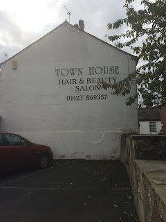
Every where throughout the town has an aspect of the old, these metal signs (left above) were placed up next to an old shop and by the looks of the condition of the signs they have been up since they were made (50's/60's). To the right is a massive sign for a salon, again the use of type to keep within the aesthetic of the town is very much inherent, using a very classy looking serif font which employs lots of flourishes, the 'T' and 'H' in this sign are very sleek and gothic in a sense yet again this type does not look out of place even though it is a modern style of business it still keeps with the old style town.
Throughout the town the street signage is still the same ones which have been up since the sixties with the Serif font being used instead of the modern san-serif used today, again this seems like a choice to keep in with the aesthetic of the village, to make the audience feel like they are walking through a town lost in time. As well there is nothing wrong with these signs, they are legible and clear in view, the feeling of "If it isn't broke don't fix it".


Again the shops continue to use Serif fonts for there signage and though some of these are modern businesses the use of this type on the store front gives the audience the impression it is an old shop, this is done to work with the other shops and keep the image and reputation which the town has built for itself.
The two images above do not follow the style of images which are above these are two examples (rare examples which were in the town) which stood out as they were different and had a more modern feel to them, especially the bottom one, for Knaresborough kitchens, there identity employs a san serif typeface and a more modern looking sign, where as the image of the skip shows the businesses' name and phone number through stencilled graffiti, these two contrast with the other images taken.


No comments:
Post a Comment