Monday, 31 October 2016

OUGD506 Type In Context

Jan Tschichold - The Form of the Book

THE REAL reason for the number of deficiencies in books and other printed matter is the lack of - or
the deliberate dispensation with — tradition, and the arrogant disdain for all convention.

THE TYPOGRAPHY of books must not advertise. If it takes on elements of advertising graphics, it abuses the sanctity of the written word by coercing it to serve the vanity of a graphic artist incapable of discharging his duty as a mere lieutenant.

ONLY WHEN a book presents itself so pleasantly, when the object book is so perfect that we would spontaneously like to buy it and take it home, only then might it be a genuine example of the art of
making books.

The opening of Jan Tschicholds book, The Form of the Book, looks at three rules which Tschichold believes are needed for designing and producing a book. Tschichold is very passive aggressive in the way he writes, he tends to use forceful words to try enforce his point and make his opinions seem like rules that must be followed as he himself believes his way is the best. Though these were his thoughts in 1940, the time the book was written, the ideas and ways in which he describes are still very relevant today and are still used by designers today. Tschichold thinks of designing a book as an object to sell and that when someone wants to buy it, that is when you see the point or the 'art' in making books.

Every Book Starts With An Idea - Notes For Designers - Armand Mevis

Mevis' essay on book design and producing books starts by looking at the Frankfurt Book Fair and how the idea of 400,000 new books which are displayed at the fair every year cannot be as good as it should be, even calling it a 'Hellish' place, stating that "out of all these books there must be only a few hundred whose design is worth looking at, fewer to talk about and fewer still to discuss in depth" Mevis believes there should be less books and better content and that the idea of such a huge number cheapens the art of making a book, yet that though there are many people designing and making books and its a 'Jungle' that this is part of the adventure, it will be tricky but you will learn.


THE TYPOGRAPHY of books must not advertise. If it takes on elements of advertising graphics, it abuses the sanctity of the written word by coercing it to serve the vanity of a graphic artist incapable of discharging his duty as a mere lieutenant.


Monday, 24 October 2016

Product and Issues.


The cover and title are inspired by both poster boards around leeds which are layered with posters many of which are ripped and weather worn too creating new imagery, the decision for the cover to remain physical rather than scan in the imagery and making a flat cover came from looking at unique cover designs, with the layered collage as the front cover, each copy will be unique and can be ripped and torn and still have imagery underneath. The title style was inspired by the research into punk zines of the 70's, looking at music culture in general, one iconic piece of art work which inspired the style of the title was The Sex Pistols 'Nevermind the bollocks' album cover.


The book required a small description to simply explain what the content was about, looking back at my aims and objectives one of them was '' produce a publication which looks at the music culture of leeds " so the title 'A look at Culture and music in Leeds through poster art" Felt appropriate and relevant to the content. 


The layout does change throughout but a clear pattern emerges as the set up of the book will go page 1 = Full Image 2 = small image + type 
this alternates but the larger posters are ones which are vibrant and busy and need a larger space, the book flows well with this layout being used. The type is concealed at the bottom of the pages, this is inspired by the research into poster art and form, the small type is simple descriptions of each image to clearly put across the information which is on the posters, some pages do hold more information, for example 


To keep with the collage style from the cover and book title it felt appropriate to hold the name of the author of the book in the back also in a collage style.


Sunday, 23 October 2016

OUGD503 - Looking at D&AD + YCN

D&AD and YCN past briefs

YCN

- Playful
- Inspiring
- Creative
- Tactile
- Expressive
- Vibrant
- Social
- Modest (Understated)
- Student focussed
-

Established in 2001, YCN is a curated, creative network. We help creatively minded people and organisations to make relevant new connections, to learn and to do.
D&AD
- Corporate
- Clean
- Structured
- Systematic
- Intimidating 
- Dense
- Visual
- Commercial

Formed in 1963 by David Bailey, Terrence Donovan and Alan Fletcher as the British Design & Art Direction, following there first year they organised the first award event where they choose just 16 winners from thousands of entrants and award the winners with the Yellow Pencil. The D&AD celebrates the best of the creative world and continues to inspire people now, with the organisation being bigger than ever and is now world renowned by creatives.

Consistencies in award winning work:
- Nothing left to interpretation
- Placed into Context
- (D&AD) Commercial Briefs
- (YCN) More Hypothetical Briefs
- Worked in different context, Campaigns, can be applied across all formats and can run for a long time
- Impeccable presentation (layout, photography)
- Idea and Concept driven
- Simple
- Innovative


Looking at how the designers approach briefs and how they progress to reach a final solution to the brief. Looking at the YCN annual 2015/16, YCN or You Can Now, is a


ATLAS - 

Atlas' branding for the Barcelona design museum, the job was to produce an identity for the catalan museum, the identity rebrand was covered by creative website 'It's Nice That' where they said-


"How to merge tradition and modernity? To create something beautiful, that doesn’t detract from the work itself? So when Mallorcan agency Atlas put forward their proposals for the new Barcelona Design Museum’s identity, it’s perhaps little surprise they worried their ideas were “too modern and risky.”

and

"The look and feel is crisp and bold, and is based around the idea of a “connecting line” to represented the “unique geographic location of the building,” Atlas explains. This line is carried through both 2D and 3D applications, which were developed alongside the museum designers NUG Architects."

The design for the rebrand includes aspects such as -

Way finding
Works through screen and print
Appropriate for the design target market
Includes context based on buildings geographical location
Simple and concise layout
Brochures, signage, prints and merchandise
Transferable
Bright yet not overpowering.


Catherine Perrott -

The brief was to create a visual identity design for an art gallery to tour hospitals. 

Perrott relates the context of the design to the hospitals and acts as if the exhibition has been admitted to hospital itself. The branding works in partnerships with Britain's most contemporary galleries. The main aspect of the branding is using a yellow over lay that works with already existing printed media, web pages and gallery spaces.


Design Considerations.

 Looking at a number of aspects of design production I collated the content into a small a5 zine to get a feel for how it would look. The images seemed lost on the page and the size of the zine did not show the images large enough, the posters needed a wider space so that details could be seen and appreciated. The paper was regular cartridge paper which was influenced by old zine styles of cheap manufacture for wider distribution. Continuing to research into different sizes of publications it is clear a larger size is required to fully show the content of the book.


For the cover, the initial idea was to design it like a poster board with layers upon layers then scanned in, this idea then changed to collaging a poster from all the posters received which would form the front cover. The cover would be influenced heavily by the poster boards, this rough style also links in with other research undertaken. Changing the dimensions of the book to a4 give the book a long feel like it was out of proportion with it being to high and not wide enough. Continuing to look for a more appropriate size to the book, it seemed that all poster books had the width of an a4 page of paper but with a shorter height, for example -


'Oh So Pretty. Punk In Print.' - Toby Mott

A Visual guide to the punk movements from 1976 to 1980, looking at periodicals, posters and art work from the time of anarchy and anti establishment fuelled sub culture which stormed the nation. It presents 500 artefacts - 'zines,' gig posters, flyers, and badges - from well-known and obscure musical acts, designers, venues, and related political groups. While punk was first and foremost a music phenomenon, it reflected a DIY spirit and instantly recognisable aesthetic that was as raw and strident and irrepressible as the music. As disposable as the items in this book once were, together they tell a story about music, history, class, and art, and document a seismic shift in society and visual culture. The books dimensions are 280 x 215 mm (11 x 8 1/2 in), this size would be efficient for Leeds Music Culture publication as it would allow images to have enough space for clear viewing as well as space for descriptions.

For the binding initially the idea was for the publication to be a zine style which would be made entirely from paper, but looking at the experiments attempted, e.g the cover being a collage of torn up posters, this would then be scanned in, but having seen the outcome of the experiments it became clear that the cover should remain a collage on a hard back cover bound with tape with the pages of the book with a simple saddle stitch, this would keep the publication clean and easily read.  For the idea to collage the front cover it was clear that the collage had to wrap around the edges of the grey board so that it was covered entirely. The saddle stitch and book tape idea was attempted to see if they worked, the book tape wraps well around the covers to merge it and from the front and back though the saddle stitch through the tape does not work to well, there is no relevance to it, it is best to keep this stitch hidden behind the tape.


Keeping with the collage effect, and creating a look for the book, the title needed to be placed within the book as the covers were purely poster collage, a concept was thought of to have the title of the book and author name in collage within the first few pages of the book.

The letters were ripped from the posters used to make the collage, this gives a punk sort of feel (Influenced by the zine research) This will be stuck into the first few pages of the publications taking up the entire page.


Design Decisions. Design for Screen. Paper.


The development and design experimentation was informed by the research undertaken into zine and book design, the form to begin with was inspired by punk zines, having it small and with thin paper so that it could be cheaply produced in the rough styles these zines were formed in. Though with the publication being image based it became clear to use a thin gloss paper. Using a highly professional clean looking paper would not have been relevant to the style of the concept or the contents of the publication. Having looked at cheap papers which would have been available to the zine producers I found a 100 GSM recycled paper which had a slight rough grain to it which is influenced by the posters them self which many of use this type of paper.  It was clear to use this style to give it a rough edge yet with the gloss to the paper the images would print clearly onto it.


Saturday, 22 October 2016

Publication Content - Design for Screen

Having collated the contents of the posters after emailing various bars and businesses for posters, they needed to be sorted and collated into a working order and researching more information to caption the each page. A small caption about the Musicians and the place they're playing, to make sure its clear. 


  1. Page 1 - Flyer for Cate Le Bon at Brudenell Social Club, 21st December 2016. Courtesy of Jumbo Records.
  2. - Flyer for Preocupations + Merchandise, Nap Eyes, Post War Glamour Girls and EZTV at Brudenell social club, 5th november 2016. Courtesy of Jumbo Records.


(Full size) - Poster for Pauw (Dutch Physcedelic band) at Oporto, 30th October 2016. Courtesy of Jumbo Records.

 Flyer for Billy Tallent and Say Yes at o2 academy Leeds, 20th October 2016. Courtesy of o2 Academy leeds.


Poster for Cassie Ramone (American musician) + Colleen Green (American indie pop musician) at Brudenell Social Club, 28th September 2016. Courtesy of Parkside Tavern.

Flyer for Don Vito (German, Noise rock/Tremor wave band), Daikiri (French, Samba Noise band), L.C.D.P (Italian, Meditative band) and Beards (Leeds based band) at Packhorse Leeds, 25th October 2016. Courtesy of Jumbo Records.


Poster for NAO (British soul and electro singer) at University Stylus, Leeds 27th October 2016.  Courtesy of Leeds Met Student Union.

Poster for Simian Mobile Disco (UK Electro Duo) at Headrow House Leeds, 3rd  December 2016. Courtesy of Headrow House.


\

Poster for Margaret Glaspy (American Singer, Song Writer) at Headrow House, 6th November 2016.
Courtesy of Headrow House.

Flyer for The Felice Brothers (American Folk Rock Band) and Horse Theif (American Indie folk rock Band) at Brudenell Social Club Leeds, 23rd January 23rd January 2017. Coutesy of Brudenell Social Club.


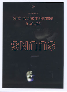
Flyer for Suuns (Canadian Rock Band) at Brudenell Games Room, Leeds 23rd October 2016. Courtesy of Brudenell Social Club.

Poster for Jagwar Ma  (Australian Psychedlic Dance band) at Brudenell Social Club Leeds, 25th October 2016. Courtesy of Brudenell Social Club.

Poster for The Computers (Britsh Rock Band) at Brudenell Games Room, 7th October 2016.
Courtesy of Jumbo Records.


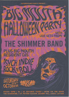
 Flyer for The Shimmer Band (Bristol, psychedelic band) at The Wardrobe Leeds, 23rd January 2017. Courtesy of Jumbo Records


Flyer for Porches (Porches is an American synthpop project of New York based musician Aaron Maine, formed) + Polo (Leeds Pop band) and Japanese Breakfast (New York Pop band) at Brudenell 

Social Club Leeds, 30th October 2016. Courtesy of Brudenell Social Club.

Poster for Happy Daggers + PNEUMA, Meihaus and Peakes at The Wardrobe Leeds, 10th December 2016. Courtesy of Crash Records.


Flyer for Hang Loose event night Ft. Esme Bridie (UK Singer / Songwriter), Jonny Woodhead (Manchester based singer/song writer) at The Wardrobe Leeds, 27th October 2016. Courtesy of Jumbo Records.

Flyer for Puppy (London grunge, rock band), Hinges (Leeds emo, grunge band) and Cold Summer (Wakefield grunge, rock band) at The Key Club Leeds, 8th October 2016. Courtesy of The Key Club.


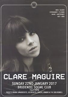
Poster for Claire Maguire (English Artist) at Brudenell Social Club Leeds, 22nd January 2017. Courtesy of Brudenell Social Club

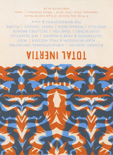
Flyer for Richard Dawson (UK Folk Singer) + Many More at Wharf Chambers, Leeds 23rd - 25th September 2016.Courtesy of Crash Records.


Flyer for Tourist (British Electronic Musician) at The Wardrobe, Leeds  30th November 2016.
Courtesy of Jumbo Records.

 Flyer for Tourist (British Electronic Musician) at The Wardrobe, Leeds  30th November 2016.
Courtesy of Jumbo Records.

Poster for Super Hans (English DJ and Performer) at The Wardrobe Leeds, 15th October 2016.
Courtesy of The Wardrobe.

Flyer for Hot Creations Event  (Independent dance label) at Mint Warehouse Leeds, 12th November 2016. Courtesy of Jumbo Records.


Poster for Bright Light Bright Light (Welsh solo song writer) at The Wardrobe Leeds, 30th October 2016. Courtesy of Crash Records.

Flyer for Matthias Tanzmann (German Techno and  House DJ), Sante (German Techno DJ), Sidney Charles (English Techno Dj and Producer) and Katja (Unknown) at Church, Leeds 21st October 2016. Courtesy of Jumbo Records.


Poster for Sun Ra Arkestra  (American Jazz Band) at Belgrave Music Hall Leeds, 27th November 2016. Courtesy of Belgrave Music Hall.

Poster for Lady Leshur (English Rapper, Singer, Producer) at Belgrave Music Hall Leeds, 30th October 2016.Courtesy of Crash Records.


Poster for Cat Apostrophe (Leeds, Gutural/Capartic band), Lake Michigan (Leeds, Freak Folk, Dream Pop Band), Haystack Monolith (Scottish,Lo-Fi band) Guerrilla Miner (Leeds, Political Folk artist) at Packhorse, Leeds, 7th October 2016. Courtesy of Jumbo Records.

Poster for Polica (American guitar band) at Leeds Uni Stylus, 14th October 2016. Courtesy Of Crash Records.

Poster for Nord (Leeds based music + art event) Ft Glenn Astro (DJ) + Support at Studio 24 Leeds,22nd October 2016. Courtesy of Jumbo Records.

Poster for All Time Low, (American Rock band) at o2 Academy Leeds, 15th March 2017. Courtesy of Slam Dunk.


Flyer for Wanda Group (Algeria), D. Glare (UK), DJ Ford Foster (UK) at Temple of Boom Leeds, 18th November 2016. Courtesy of Temple Of Boom.

Opal Tapes is an English independent record label that releases abstract forms of house music, techno + other types of electronic music.