The original Logo for the sculpture park is very vague and unrepresentative of what the open air gallery represents, the logo doesn't stand alone without explanation of what it is meant to be representing. The logo is plain and dull, it is also advertised in black, which represents elegance, this is the only other representation the park has in logo form.
The logo for The Hepworth Wakefield, another gallery in the Yorkshire sculpture triangle, is again type focused, this time it is clear and straight forward with a nice clear type.
Again the Logo for the Henry Moore Institute is type focused with a black block next to the type, again much clearer and simpler than the Yorkshire Sculpture Park.
This logo is more of a symbol but is still represented through typography as well, this symbol is also used to represent Leeds museums too, it is to represent cultural places in the city centre of leeds.
I want to produce some symbol logos that truly represent what the Yorkshire Sculpture Park stands for, we went to the park for a research visit to get a feel for what it was about and the feel that it gives off.
Whilst at the Sculpture Park I saw a number of iconic sculptures which could influence my symbol. I enjoyed the Henry Moore pieces because of there abstract look yet they are still recognisable as a Henry Moore piece, they're very questionable and can be perceived differently by everyone who sees them, I would like this to be an influence in my symbols through its obscurity but recognisable quality. Another piece I enjoyed was Rabbit by Sophie Ryder, a large human female form with a rabbit head, it is a very surreal piece which is very affective.
 Many of the sculptures were either metal or marble made, both can be very smooth materials, this is a factor I must consider in the design of my symbols. As well as the sculptures I must consider elements of the surroundings within the park, the nature, wildlife, sounds and smells. These characteristics of the park will be taken into consideration when I begin to develop my ideas. I took some photographs of the area and surroundings to use.
These images show the different textures and colours seen around the park, it is a very bright and vibrant looking place when looked at as a setting yet up close the roughness on the trees gives a real woodland feel, this contrasts the smooth looking sculptures which the trees surround. The problem I face is to combine both the rough texture of the woodland and the smooth surface of the sculptures to form a symbol, I could also consider just focussing on one aspect. The colour scheme will also take consideration, there are so many different colours around it is always vibrant and lively, I must remember this when creating my symbol. The surroundings have many different natural patterns going on, I thought that the pattern from the bark on trees with all the lines and textures would form a nice look on a symbol to represent the woodland of the park.

This is the logo for the Yorkshire dales national park, they use a Ram to represent park, but using only specific parts of the rams face such as the nose eyes and horns to represent it. I like the use of blank space to show the imagery and text it is really clear and effective, it is recognisable as the symbol for Yorkshire. I like the idea of using blank space and must keep this in consideration when designing.
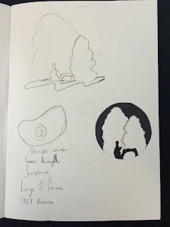
My designs began by me trying to combine the nature and the sculptures into one combined logo, doing some sketches of the photographs of sculptures I took. I wanted my icon to be subtle and simple which represents the park easily. I started with some hand drawn sketches before moving on to digital design.
I drew this one which is looking through on of Henry Moore's sculptures which you can see a tree when looking straight through I drew the view from my perspective and felt that this would be an excellent logo Idea.


No comments:
Post a Comment