- Hairdresser
- nursery
- nightclub
- toy store
- Loan company and more
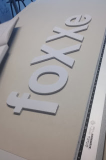
We played about with a range of orders and kerning, we looked at having tight text for a bolder feeling and then a more spread out type for a relaxed feel. This task helped me to understand the importance of the space between characters in a font, this factor can change the mood of the word being portrayed, this will help be in the studio briefs coming up and in my general practice.


No comments:
Post a Comment