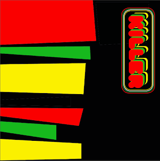
Design aspects of the miller cover. Exploring different routes inspired by the visuals researched, and using the typefaces I researched through the latter. Experimenting with retro design styles to achieve a throwback record sleeve style.
For the text I chose to use Jacob Millers Nickname ‘Killer’ something Miller himself has used on album covers. Through this I give just enough Identity away for the viewer to want to look more into it.
The development saw the incorporation of a visual, an outline of Jamaica, which I added to it a gradient which changes from green through to yellow and to red, with a black and white half tone. This effect is inspired by the old style of visuals used on album covers in the 1970’s and 1980’s.
Through peer feedback, the elements and styles which were best recieved were the over filled type below, these reflected the 1970’s Rastafarian music scene.


No comments:
Post a Comment