Tuesday, 15 March 2016

studio brief 3

Group 5 -

Research

-Typeface  -WayFinding  -origami  - colours  - posters  - location

Concepts -

Vegas (look at casino elegant styles, gambling, bright lights, gaudy over glam style of decor and type face. Using bright colours and lights to show the theme)

Origami (Looking at Japanese paper folding using money notes, ripped up for poster and invite purposes to create a shadowed effect on flat posters taking inspiration from researched posters)

Spy Theme (60's theme which will emulate a British spy theme, James Bond style of decor and typeface. Inspired by the title of the brief 'Licence to print money' a play on words from a james bond movie and book title 'Licence to kill'

power    ( Power to print money. Monopoly style perhaps? Good power? Dark Power?

stock market - idea looking at the rise and failures of the stock market, contrasting the hand produced pieces within the gallery which are to represent currency.

History/ timeline (producing a timeline of key moments in the history of currency from around the world, key dates being throughout the gallery all leading to what next? could be placed down the hall of the corridor leading to the gallery until you reach it.

Social look at money (Looking at social classes and stereotypes of class and its direct link to money and currency and how it changes people and how society acts towards money?)

Focus on the methods of production?  (base the exhibition on the different processes we have to use to produce, I.E monoprint, screen print, type set. Look at the methods and break down?

Change peoples concepts of money

the colour of money

architecture - brutal, ugly, sharp, form

types -


typography - I looked at styles of type which have been related to money and wealth, often taking a serif style and using thin and thick sections. Both of these could represent themes which we have discussed within the group, I felt the styles could be used in a number of contexts and themes.


The four above have given me a number of ideas of styles to use including, famous people, architecture, collage and type face.

The poster for 'LODZ' in the bottom right hand corner can be interpreted to use in the context of this brief.


With the broadness of the research I could conduct at this stage of the brief I scoured through pinterest looking at art, type and posters (Most of which are for previous exhibitions) I wanted to see the examples and innovative ideas of previous exhibitions, to see what styles were used to advertise the art space. We need to create an environment for people to experience the art not just a place to view some art, it has to be innovative and exciting as it will be the first time networking with other creatives who we plan to invite.


Wednesday, 2 March 2016

Money Research

The Royal Mint are currently running a competition to see who should feature on there twenty pound note, it must be a historic figure of visual arts, a painter, fashion designer, ceramic designer, photographer or graphic designer. They have ran an open poll asking who could be honoured on the 20 note, where the public have so far put forward hundreds of names of historic figures in the visual arts (590 so far). People such as Stanley Kubrick, Marie Tussard and Albert Irvin to name just 3, showing the wide spectrum of people that are all being considered. I find this style of finding a designer very fair, a national affair and to honour a person from the art world in such a way is long over due.

Money - Research


In 2010 the Federal Reserve held a competition named the dollar redesign project. Designer Dowlin Duncan submitted this set of colourful modern style designs, his entry showed a very strict graphic skills style, as well as using Imagery and fact within the design. The theme for each bill was;

One Dollar : Barack Obama, the 44th US president yet the first african american in the job which is why he was on the one dollar bill. 

Five Dollar : The five biggest Native American tribes. Using patterns as well as imagery.

Ten Dollar: The Bill of Rights, the first 10 amendments of the US Constitution.

Twenty Dollar: Images representing 20th Century America.

Fifty Dollar : The 50 states of America.

One Hundred Dollar: A timeline of the first 100 days of Franklin Roosevelt's Presidency.

The use of colour and shape within the designs is so smart and well worked in how it feels more like art than a bank note, he refrains from using the dollar sign which makes it not feel like currency but just a representative of a number on paper. These designs sparked controversy as his use of President Obama while still being president, something which Americans cant handle as a concept.


Money


Following the briefing I began looking at the current currencies I was familiar with, Euros, Pound and American Dollars, looking at structure and layout, the pound and the Dollar have more unique patterning and layouts in comparison to the Euro, yet as the Euro is used in multiple countries it would be difficult to use unique defining imagery or shapes while also trying to represent the countries who have the euro as currency. The Pound employs the current Monarchs face as well as a distinguished person of British history for example characters such as, William Shakespeare, Charles Darwin, Sir Isaac Newton and florence Nightingale, with characters such as Sir Winston Churchill and Jane Austen to be on the next designs in the coming years. 

The American Dollar shows former US presidents and founding fathers, as well as national buildings in the US. Characters to appear on the notes are, George Washington, Thomas Jefferson, Abraham Lincoln and Woodrow Wilson, amongst many more. 


I began to look at more outlandish and artistic currency notes from around the world, looking at designs which stood out and looked more like illustrations than bank notes. I looked at the use of line and shape and found it is always used to create a sense of elegance or decoration on the design. Many of the designs I looked at used a floral pattern for decoration around a centre piece, making the character or piece of architecture more majestic. Some of these countries use there currency as a canvas to show some of there most praised buildings and honoured patriots and monarchs.


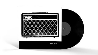
secret seven final


Further Designs, Type - image


Here are my final resolutions for the secret seven brief. I have chosen to add type yet japanese (this is inspired by my research into ROST and his Berlin work which utilises Japanese type to accompany his imagery). I chose to have a white strip at the bottom of the Page which would work to clearly see the type and balance the entire design. I have decided to enter a number of these similar designs which would work as a set. I have chosen three songs, Tame Impalas 'The Less I Know The Better', The Jam's 'Art School' and John Lennon's 'Imagine', all are unrecognisable unless you can read Old Japanese.